COVID-19 Dominates
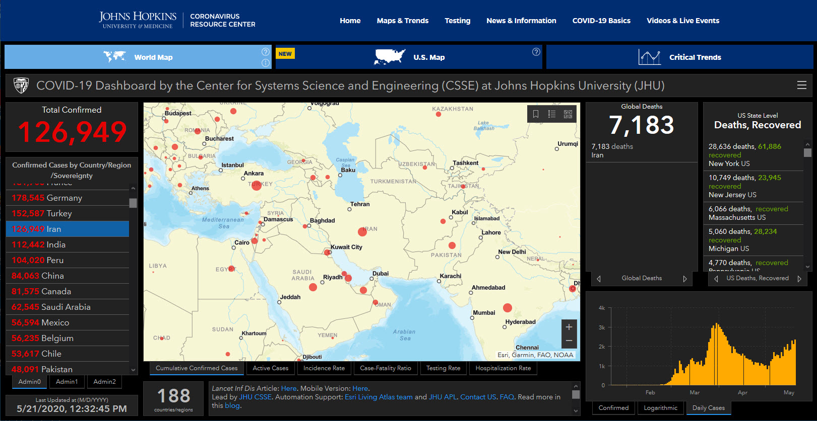
Sadly, the most viewed map these days is the Johns Hopkins COVID-19 Map developed with an ESRI ArcGIS Dashboard.
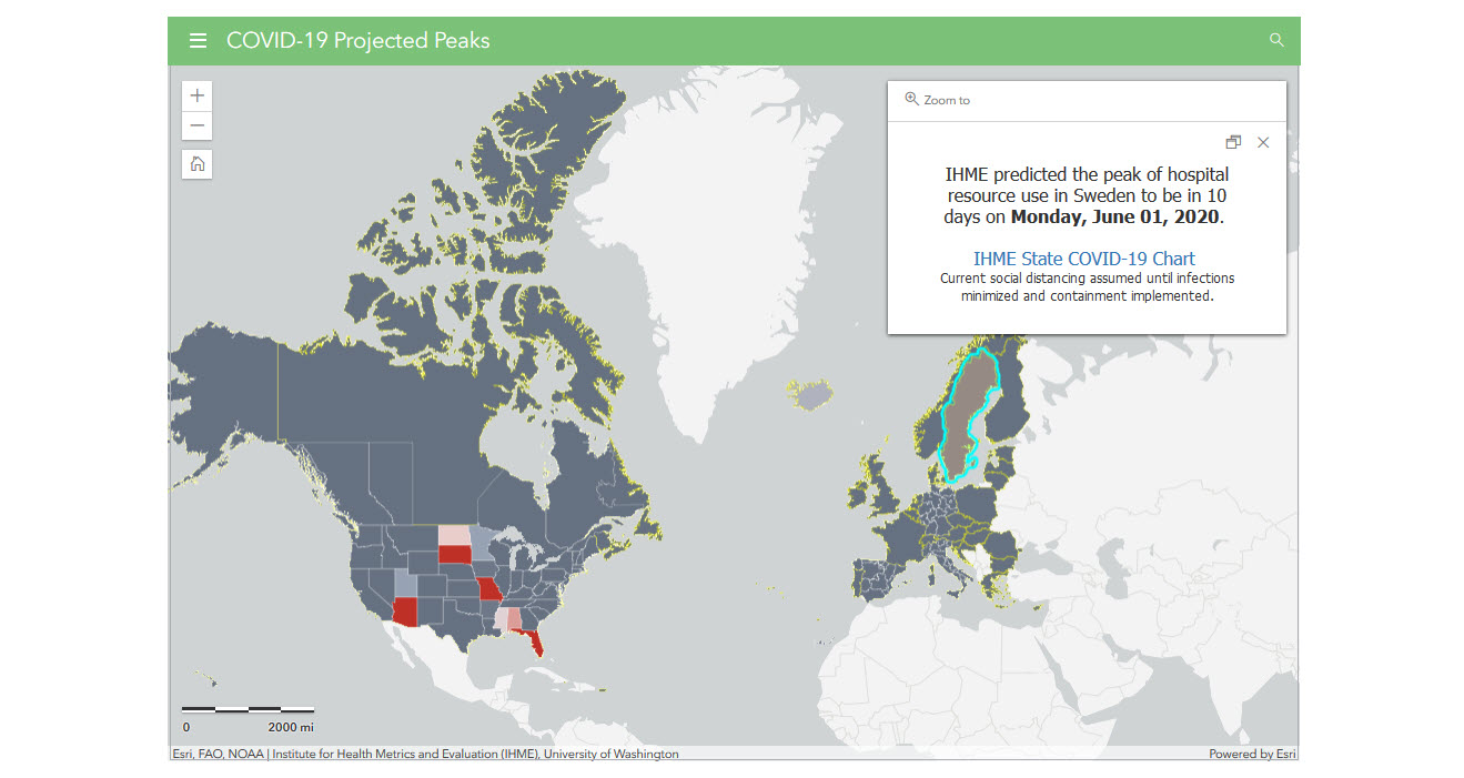
More maps built with ArcGIS can be found at https://coronavirus-resources.esri.com/, including the projected peak map developed by IHME at the University of Washington.