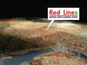
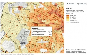
 The exhibition, Red Lines Housing Crisis Learning Center at the Queens Museum of Art (through Sept 23) is a large scale installation by Damon Rich, founder of the Center for Urban Pedagogy. The New York times reported on the exhibition’s extraordinary centerpiece, an intricate conversion of the museum’s most famous work, the Panorama of the City of New York , to depict the location of foreclosures in the five-borough area. The Panorama is a 9335 sq. foot scale model (1 inch = 100 ft) of Manhattan and all five boroughs made in 1964 for the World’s Fair, and updated in 1992. On top of this 3-D “map”, Damon and his young helpers placed bright pink plastic triangles representing blocks where 3 or more foreclosures have taken place. The result shows the concentration of foreclosures in areas where the non-white population is highest.
According to the Times: ”Hundreds of these pink stigmata cover Bedford-Stuyvesant, Crown Heights, East New York and Canarsie in Brooklyn like an invading army. In Queens most markers are camped out in Ozone Park and Cambria Heights, as well as in parts of Jamaica and Corona. As for Manhattan, there are precisely two.”
 The neighborhoods with high foreclosures, according to the Times, are the same areas where the disastrous practice of “redlining” denied credit to African-American and Latino families until it was made illegal in the 1970′s. The data used in creating the exhibition was also used by NY Times staff to create a great interactive map which allows you to see the growth of foreclosures across the area, and at the block level, since 2005. Frightening!
Update 5/7/2018: New Forclosure Maps from PropertyShark
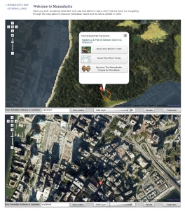 Planning a trip to New York? The Museum of the City of New York has three exhibitions of special interest to Nederlanders. This one is for map-people, too. Written-about in an Arts section review in the New York Times, the exhibition sounds a delight, and there is a book by the exhibition designer, Eric W. Sanderson and a clever Google maps mashup website about the Mannahatta Project sponsored by the Wildlife Conservation Fund. Time to travel.
