Africa – Bigger Than You Think
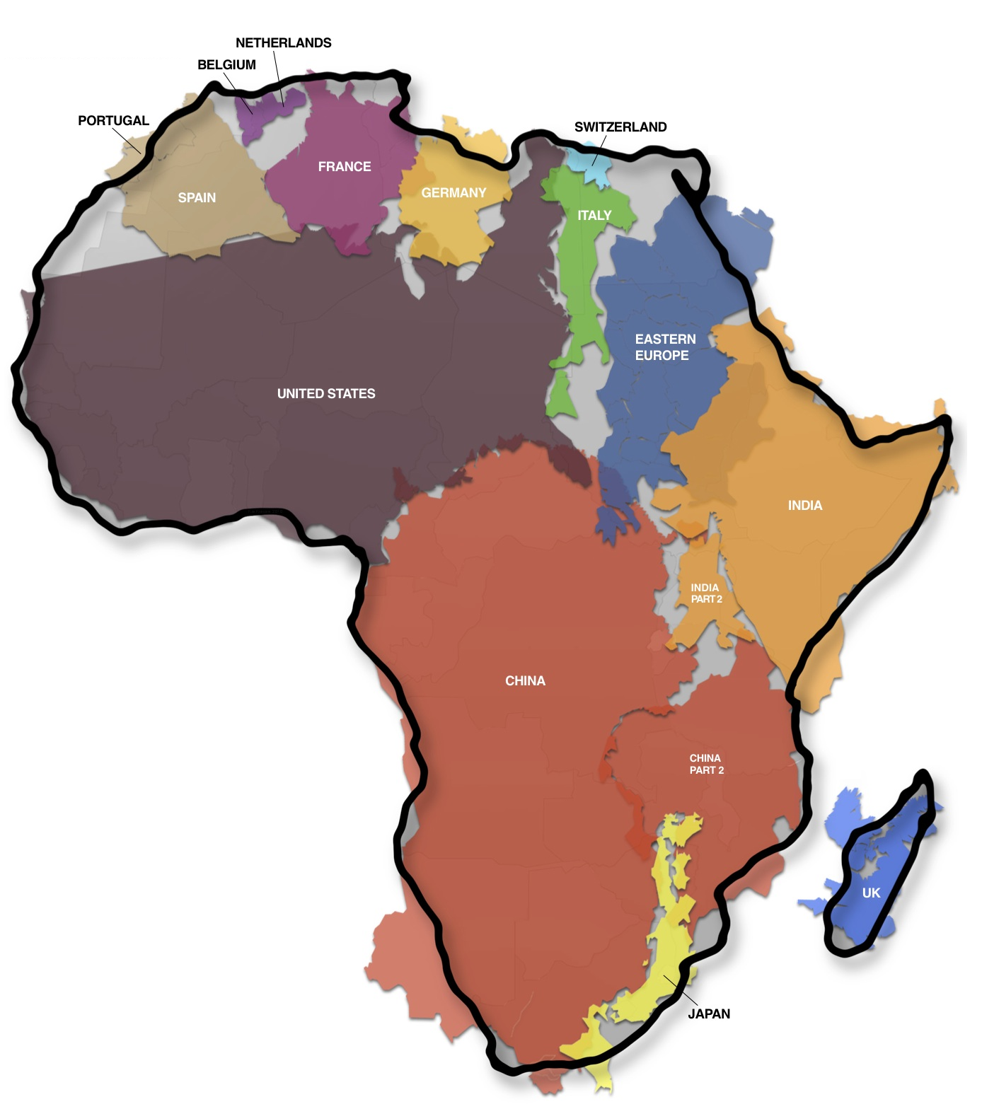 Just came across a graphic produced in November 2010 by Kai Krause which shows Africa swallowing up many countries and even continents which we typically think of as larger, including the US, China, and Europe. Mr. Krause points out that the great misconception has been propogated by the standard use of the Mercator Projection which was created by Mercator in 1569 to represent the world in such a way as to keep make it easier to navigate from one place to another because it flattens the earth and turns it into a rectangle. Therefore the areas of countries closer to the poles are exaggerated, while those closer to the equator are understated.
As was pointed out by The Economist, the actual graphic used by Mr. Krause is not a perfect representation of the proportions. For a more accurate representation, the writer used the Gall’s Stereographic projection (which I used to use at Johnson Controls!) which is an “equal area” projection designed to keep countries areas in proportion. The conclusion is the same, maybe a little less dramatic, but another nice graphic.