Wonders of Reddit – Colonial America


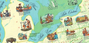
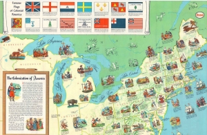
Very, very late to this game, I’m discovering the wonders of Reddit – specifically the subreddit “Map Porn“, and the title sums it up. For starter, there is this 1957 educational map created by Esso Standard Oil which was recently posted. The comments are also great, including critique that the Dutch flag and colors are wrong… and that this was an America without slavery!

Note also, that Seneca Indians in New York State used oil from a spring (second zoomed image) – apparently for medicinal purposes. Fun fact (as they say), this is recorded as the discovery of oil in America! Dive in here – also an interactive map website. No more oil here, but a rich history.

Conflict and Bridging Divides


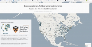
The website Armed Conflict Location & Event Data Project is a rich resource for data about conflicts and protests in the US and worldwide, with multiple links to other sites and databases.  It is a bit shocking, but the story covers the last year and puts it all a bit into perspective, with much good background information.  (Hoping it is all factual, which it is likely to be given the sponsors.)

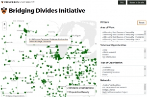
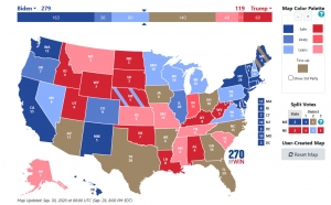
Through a link on this site, to the Princeton Bridging Divide’s Initiative, an interactive map showing up-to-date conflict events and organizations in the US, with the ability to drill down and learn more about organizations or specific events.

So how does this make me feel?  Amazed at how complex the US is, but also how great that there are so many organizations whose mission it is to “bridge the divides” in the currently very divided society.  We don’t hear about these efforts in the news.


World Food Program


World Food Program won the Nobel Peace Prize 2020.  The agency was given the prize for its efforts to combat hunger and improve conditions for peace.

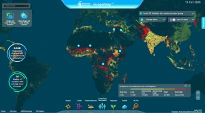
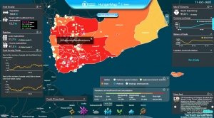
This interactive “Hunger Map” contains an amazing amount of detail and links to numerous databases tracking the world situation on a daily basis.

Some of the indices and trends are not as clear as others, but this appears to be an amazing data resource. Overlays include vegetation, rainfall, crises of all sorts, conflicts, and COVID-19 cases and deaths.

Take Yemen…

Gerrymandering – the Line Dance

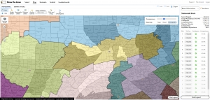
The 2020 U.S. Census controversy brings attention to many mapping issues, most importantly the recent U.S. Supreme Court ruling on Partisan Gerrymandering.  GIS Software is sometimes viewed as the guardian angel, abut more often the devil in the bizarre American governmental process of “redistricting”.  This occurs on a state-by-state basis after the completion of the census, which is held every 10 years, with the purpose of readjusting voting districts to take into account changes in population and demographics.  The idea is to improve representation, but the process has become deeply politicized.  This is a good, simplified explanation:  The Line Dance, by Chris Satullo, director of the Draw the Lines Project.  Along with the website providing a wealth of information, links and instructions for Pennsylvania’s version of DistrictBuilder open source map application, designed by Azavea, encourages the public to understand the redistricting process and submit their own maps which reflect their wishes.  Here is an excellent video tutorial.