Magic Planet

An exciting approach to understanding the Earth is offered by Global Imagination based in Santa Clara CA. This article in the New York Times describes applications in schools, museums, industry and government. Magic Planet globes range in size from 40 cm to 3 meters with a projection system which is either built into the base or external, and software for showing or creating custom geography-based stories. China is a booming market, and worldwide the education technology market is expected to grow from 31 billion to 60 billion during the next five years.

TeleGeography Tells a Story

An interactive map of Submarine cables by Telegeography lets you explore the huge underwater infrastructure of communication cables. The first transatlantic cable laid in in 1858, and the rest is Wikipedia history. We tend to think ofsatellites and wireless communication as being dominant, but actually 99% of global Internet traffic depends on submarine cables. Telegeography made this maps by drawing routes and points with Adobe Illustrator, importing into Avenza’s MapPublisher, exporting to KML, creating Google Fusion tables, and publishing using the GoogleMaps API. (Here is their helpful explanation.)
Interactivity allows you to select and isolate cities, or cable systems to get more details. For example, this images shows the Atlantic Crossingcable which connects Beverwijk and Brooklyn. And this is the famous (and longest at 39,000 kms) system, the SeaMeWe system.

Sixth Sense

Sixth Sense  is a multi-component wearable multi-function device invented by Pranav Mistry, a researcher at MIT’s Fluid Interfaces Group.  It was demonstrated at the TED conference in February this year by Belgian Patty Maes, leader of the MIT lab, and this fabulous video describes the various features, and potential applications.  Since one of the demonstrated applications is a map interface, I’m including it here, but the coolest thing (to me), is a watch created by drawing a circle on your wrist.  As I perpetually lose watches, this would be the perfect solution.

Update 4/7/2018: Pranav Mistry is now head of research for Samsung. 

USGS Vector Maps in GeoPDF

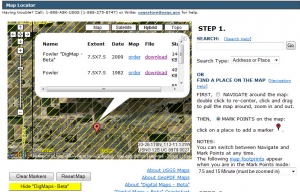
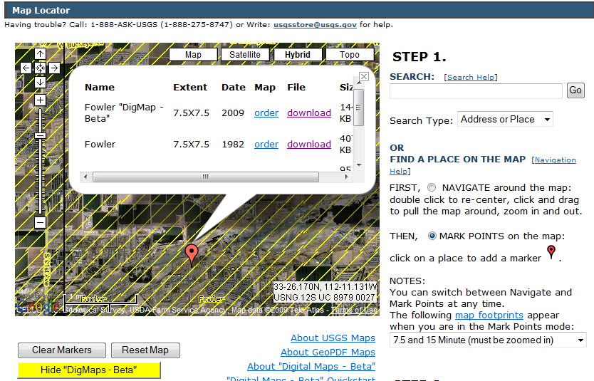
The USGS which calls itself “the nation’s largest water, earth, and biological science and civilian mapping agency” yesterday announced the availability of free vectorized topographic maps for the US in GeoPDF  format.  Details are on their Digital Map home page.  Raster images of topographic maps have been available in GeoPDF form for some time, but the new series will include vector “layers” which can be switched on and off – contours, water, transportation, labels, etc. … just like a real GIS, but much easier to share.  So far, only Arizona is available from the USGS, but much more will be released this year.

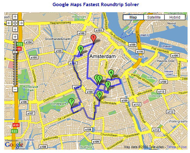
The GeoPDF reading software (TerraGo Desktop) can be download free from the developer, TerraGo Technologies.  It is essentially a toolbar which is added to Adobe Reader which makes it possible to see the layers, to do a few spatial calculations (distance and area), and with a single click, hop into Google Maps.   This is a fascinating development for the GIS world.  Late last year ESRI announced an extension for ArcGIS 9.3 for exporting to GeoPDF.  The US government is embracing GeoPDF in a big way, so little TerraGo will probably go a long way.  After three venture-capital financing rounds will they go public, or be gulped by Google?  Could we be looking at the ultimate Google/GIS Mashup?  More later.

Update 30/6/2018: TerraGo has expanded and developed new products and remains independent.  Interesting:  TerraGo Magic 
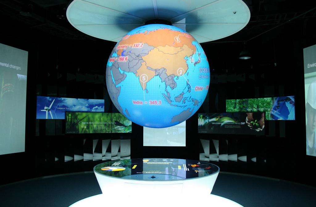
Geography of Buzz

An  article in the New York Times  today discusses the use of a GIS spatial analysis technique referred to as ”cluster analysis” for an unusual application.  Researchers Elizabeth Currid of USC and Sarah Williams of Columbia University’s Spatial Information Design Lab  presented their conclusions at a meeting of the Association of American Geographers recently.  The researchers geocoded 300,000 photos and 6000 events from the Getty Imges  database.  With this data set, the Global Moran’s I statistic was used to find hotspots in New York and LA.  The conclusions may not be so very surprising, but the use of photo media is interesting.  This type of social research is likely to show up more often as people begin to mine data from geocoded images (e.g. Picasaweb and Flickr) or geotagged Tweets.

The study was partly inspired the work of  Richard Florida who developed the concept of the “creative class” and created a stir with Amsterdam planners at a 2003 conference titled “Creativity and the City”.

Update 30/6/2018: No doubt a lot more research in this area to be found. For example Trendsmap

Immigration Exploration


The NY Times published this Immigration Explorer interactive map with some fascinating information about immigration in the US since 1880, a great example of using Flash for visualization of data over time.   You can view populations by country of origin as well, through time, though unfortunately not Dutch settlers.   Note all the Russians in Alaska!  (Of course a small number, but a significant percentage.)  The map was made with data from Social Explorer, which looks like an interesting service, though their pricing is not clear.

NYT seems to have their own flash developers, like Matthew Bloch, who studied at the University of Wisconsin – Madison (go Badgers!).  Matthew, with Prof. Mark Harrower of Colorbrewer fame, also developed Mapshaper, an online service for simplifying shape files. I can use this!  Note: the map on the right is extreme… many usable gradations exist between the two.  (This is really for GIS techies.)

Update 30/6/2018: A newer map, still using old (2007) data Migrations Mapand this good website from Pew Research showing world migration (legal)… doesn’t seem to count refugees.


Traveling Salesman Revisited

traveling_salesmanNew SweetMaps application:  the Traveling Salesman’s European Vacation.   I take no credit for the original idea or clever coding of a traveling salesman program for Google Maps developed by Geir Kokkvoll Engdahl.  (See my original  post last month.  However, while writing a research paper for a UNGIS course at the Vrij University, the idea of a sweet little application dawned on me.  This is just a start… no doubt someone else could take this further.  There are limitations, and it will be interesting to see if anyone uses it and whether my Google Maps API account will be overloaded.   I would happily take comments, suggestions, bug reports.

Update 17/6/2018: Amazingly this little PHP app still works (sort of). Try just two or three cities. The reset doesn’t seem to work, so reload the page to start over. Anyway, it was the thought that counted!

The Travelling Salesman Problem

optimap_TSP_solverGeir Kokkvoll Engdahl, a Norwegian guy born in ‘83, posted a Google Maps API  implementation of the classic Traveling Salesman Problem (TSP) called “Optimap” on his blog last July, and has since added the ability to enter multiple destinations with lat/long codes, and also the javascript source code (no longer valid link) so we can examine and play with it.   The application, of course, relies on Google’s routing engine (driving directions) to calculate distances between any two points, and it is not certain that this is always the shortest distance.  There is a bit of discussion about this on the Google Maps API Group (search on “optimal route”).  Engdahl’s program uses brute force up to 10 points, and ant colony heuristics from 11-20 points.  With Google’s restrictions on daily driving-direction requests (10,000) the maximum number of points is limited to 20… so this website won’t soon become the UPS routing-tool-of-choice, but may be useful for you travelling googlemen and women.

Update: Engdahl updated Optimap in 2012. See his blogpost.

Update Google Pricing June 2018: So much has happened to Google Maps for developers, but regarding the 10,000 hits limit, that has all changed to another pricing model.
The very latest is found here: https://cloud.google.com/maps-platform/user-guide/pricing-changes/

How Google Maps

google_earth_x600There’s a nice article in Technology Review, How Google Maps the World, with a simple explanation of the process from satellite to website.  Makes it sound so easy.  By the way, the company producing most of the high resolution satellite images is DigitalGlobe, and if you want to buy just one of the little snapshots, say a shot of the Dam Square  as an 8 x 10 print, it will cost you $19.95, so I guess we can be happy Google is footing the bill for the earth.  (Thank you Richard.)

Update 16/6/2018 – new website for DigitalGlobe, more features, ask for quote.
DigitalGlobe is a cool Satelite company providing imagery for just about everyone. Their next satelite series to be launched in 2020/21 is described in Wikipedia:
“WorldView-Legion: Currently being built by SSL, WorldView-Legion is DigitalGlobe’s next generation of earth observation satellites. WorldView-Legion consists of six satellites planned to launch in the 2020/2021 time frame into a mix of sun-synchronous and mid-latitude orbits.[31] These satellites will replace imaging capability currently provided by DigitalGlobe’s WorldView-1, WorldView-2 and GeoEye-1 Earth observation satellites. WorldView-Legion is contracted to launch on a two flight proven SpaceX Falcon 9 missions.”

EUC2007: Diamond Touch

MERL_DiamondTouchNow this is really, really cool. MERL (Mitsubshi Electric Research Labs) showed a tabletop ”touch-and-gesture-activated” screen, hooked up to an ordinary laptop and ordinary projector (suspended above). It is billed (in the online fact sheet) as “the world’s first multi-user touch technology”. Maybe gaming will be the killer app for this product, but disaster response is the GIS-related application which brought MERL to EUC2007. Continue reading ‘EUC2007: Diamond Touch’. (No longer available.)