COVID-19 Dominates


Sadly, the most viewed map these days is the Johns Hopkins COVID-19 Map developed with an ESRI ArcGIS Dashboard.

More maps built with ArcGIS can be found at https://coronavirus-resources.esri.com/, including the projected peak map developed by IHME at the University of Washington.

Tracking Apps

Traveling a lot these days, and hiking and biking. There must be a way to keep track of my travels, organize and georeference photos and video’s, take notes, maybe even record comments as I move around. So, I am looking at iPhone and android tracking apps. Here’s my starter list:

MyTracks, for Android

MyTracks for Apple (different publisher)

A collection of apps for tracking other people (e.g. kids)

Relive

A collection of apps for longer trips

Polarsteps for Android, and for iPhone.

Avenza is an mapp app which requires that you download maps to use offline – some free, need to explore — looks like an amazing map collection. You can search the database of maps online.

Gerrymandering – the Line Dance

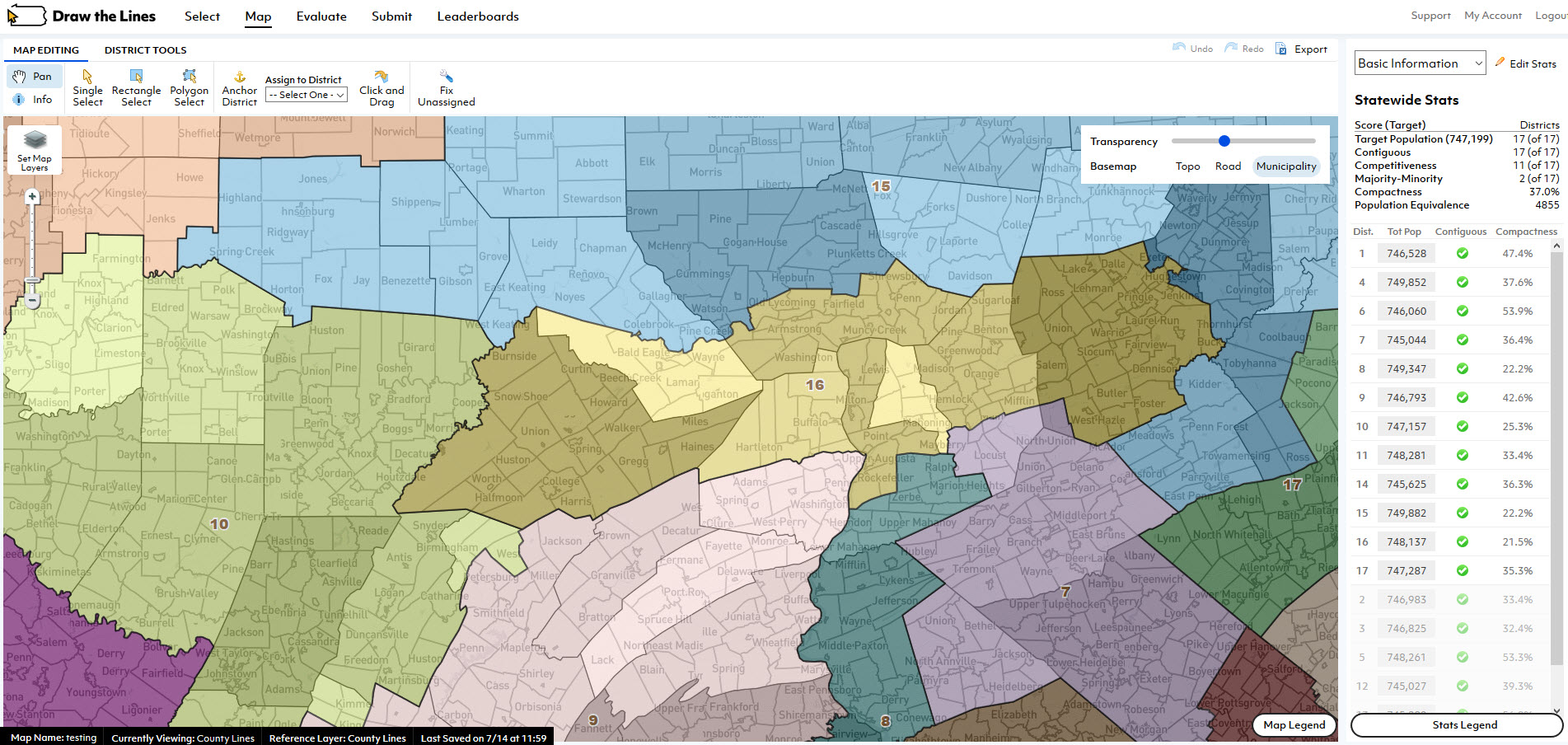
The 2020 U.S. Census controversy brings attention to many mapping issues, most importantly the recent U.S. Supreme Court ruling on Partisan Gerrymandering.  GIS Software is sometimes viewed as the guardian angel, abut more often the devil in the bizarre American governmental process of “redistricting”.  This occurs on a state-by-state basis after the completion of the census, which is held every 10 years, with the purpose of readjusting voting districts to take into account changes in population and demographics.  The idea is to improve representation, but the process has become deeply politicized.  This is a good, simplified explanation:  The Line Dance, by Chris Satullo, director of the Draw the Lines Project.  Along with the website providing a wealth of information, links and instructions for Pennsylvania’s version of DistrictBuilder open source map application, designed by Azavea, encourages the public to understand the redistricting process and submit their own maps which reflect their wishes.  Here is an excellent video tutorial.

Magic Planet

An exciting approach to understanding the Earth is offered by Global Imagination based in Santa Clara CA. This article in the New York Times describes applications in schools, museums, industry and government. Magic Planet globes range in size from 40 cm to 3 meters with a projection system which is either built into the base or external, and software for showing or creating custom geography-based stories. China is a booming market, and worldwide the education technology market is expected to grow from 31 billion to 60 billion during the next five years.

Crowdsourcing History

The New York Public Library’s Lionel Pincus Map Library has an amazing tool, The NYPL Map Warper, which allows and encourages the public to help geo-rectify their collection of historical maps. Over 2200 maps have been rectified to date.

The tool is a customized version of an open source map warping/rectifying tool (MapWarper) created by Tim Waters and MIT licensed, so available to developers. On the Mapwarper site, you can upload your own scanned maps and use the tool to rectify and export! The base map is Open Source, but after exporting, a map could be layered onto Google Maps or anything else.

Sixth Sense

Sixth Sense  is a multi-component wearable multi-function device invented by Pranav Mistry, a researcher at MIT’s Fluid Interfaces Group.  It was demonstrated at the TED conference in February this year by Belgian Patty Maes, leader of the MIT lab, and this fabulous video describes the various features, and potential applications.  Since one of the demonstrated applications is a map interface, I’m including it here, but the coolest thing (to me), is a watch created by drawing a circle on your wrist.  As I perpetually lose watches, this would be the perfect solution.

Update 4/7/2018: Pranav Mistry is now head of research for Samsung. 

Geography of Buzz

An  article in the New York Times  today discusses the use of a GIS spatial analysis technique referred to as ”cluster analysis” for an unusual application.  Researchers Elizabeth Currid of USC and Sarah Williams of Columbia University’s Spatial Information Design Lab  presented their conclusions at a meeting of the Association of American Geographers recently.  The researchers geocoded 300,000 photos and 6000 events from the Getty Imges  database.  With this data set, the Global Moran’s I statistic was used to find hotspots in New York and LA.  The conclusions may not be so very surprising, but the use of photo media is interesting.  This type of social research is likely to show up more often as people begin to mine data from geocoded images (e.g. Picasaweb and Flickr) or geotagged Tweets.

The study was partly inspired the work of  Richard Florida who developed the concept of the “creative class” and created a stir with Amsterdam planners at a 2003 conference titled “Creativity and the City”.

Update 30/6/2018: No doubt a lot more research in this area to be found. For example Trendsmap