Ends of the Earth at MOCA

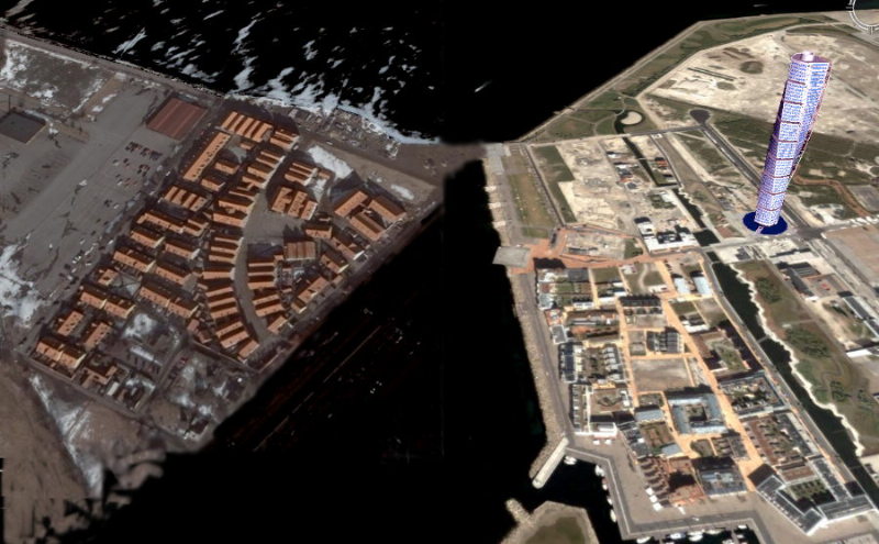
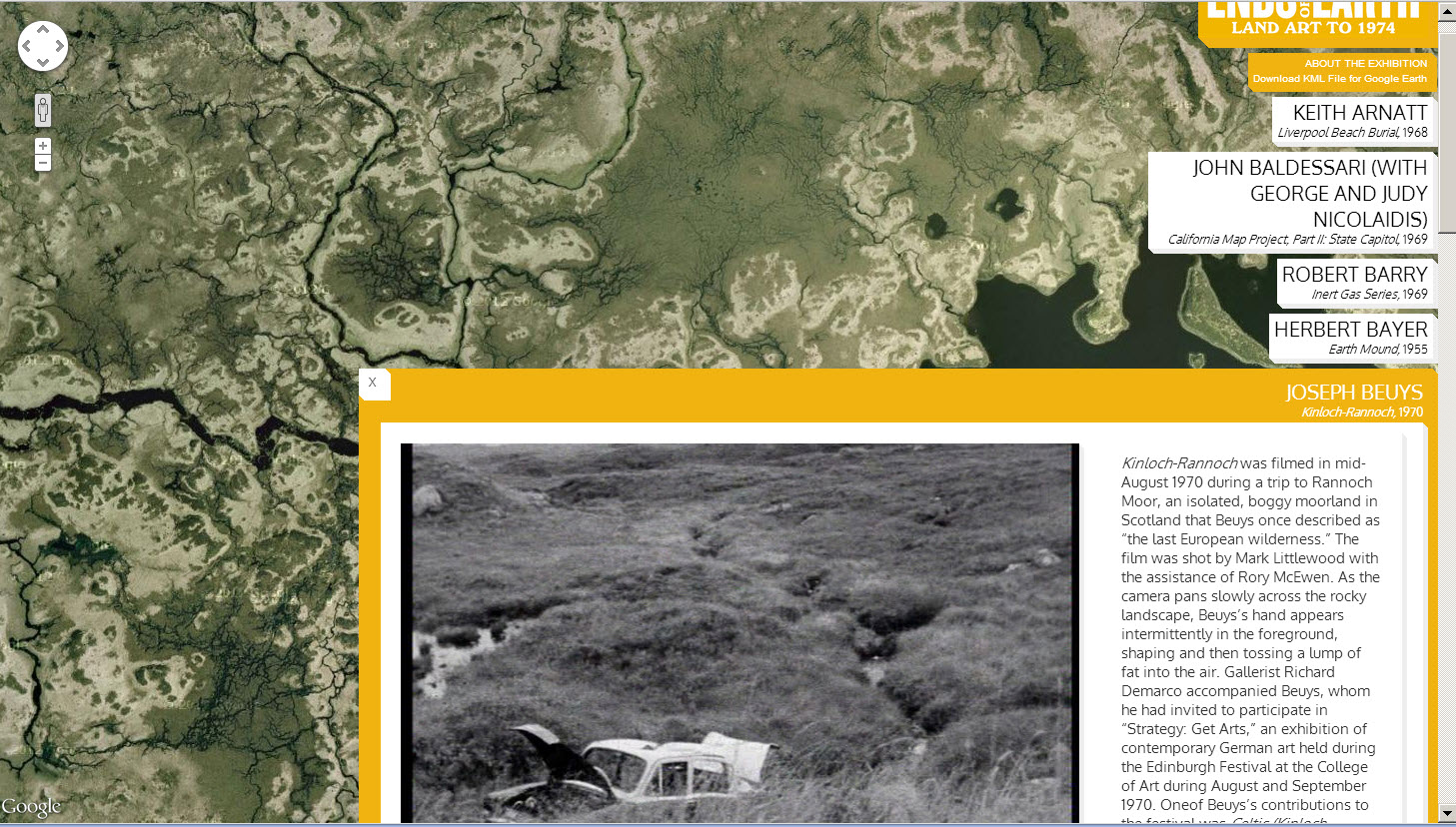
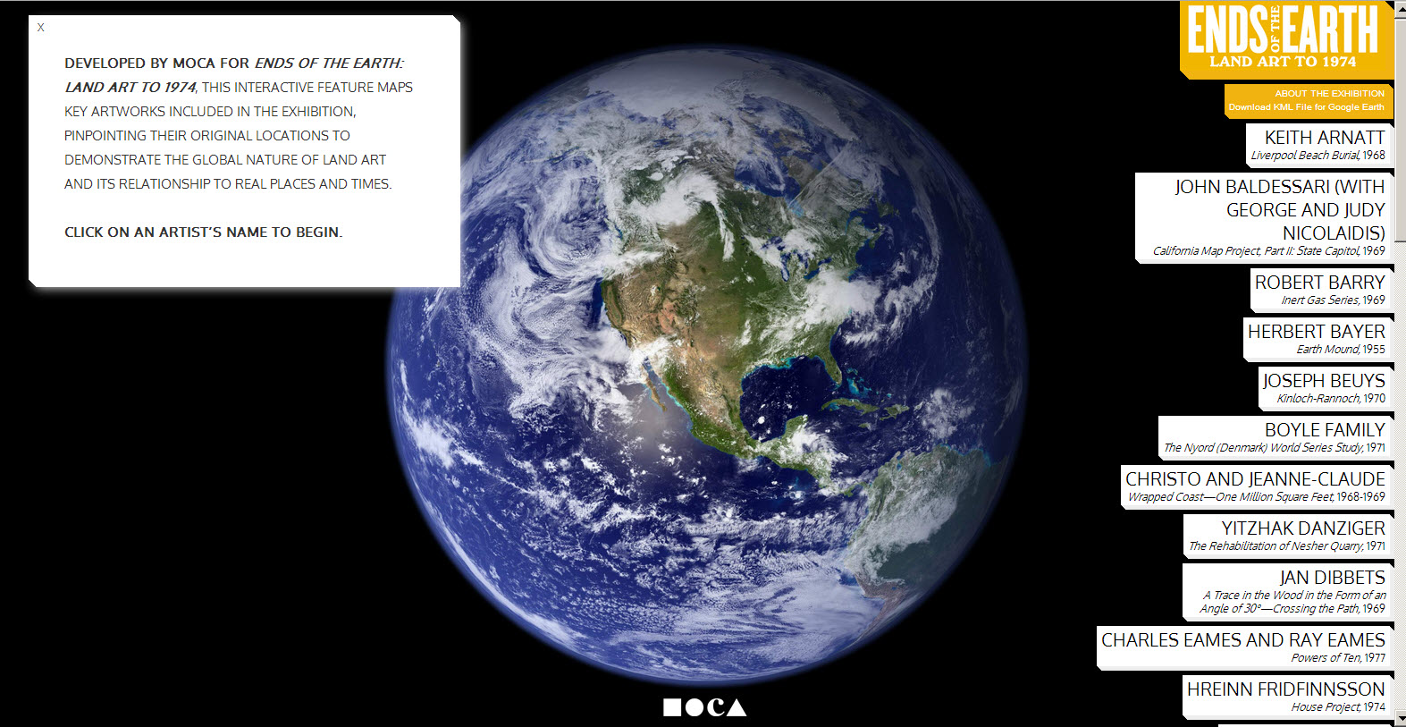
The current exhibition at MOCA (the Museum of Contemporary Art in Los Angeles, Ends of the Earth, Land Art to 1974, includes an interactive Google map which geo-locates the various works of some of the artists represented and documented at the exhibition. Over eighty artists and projects from United Kingdom, Japan, Israel, Iceland, Eastern and Northern Europe, as well as North and South Americas are included in the show. Clicking on an artist’s name zooms to the location and a pop-up window describes the work of art… like this one by Joseph Bueys in a Scottish moor in 1970.

Update 8/1/2019: The MOCA site no longer has the map, but here it is on Google Earth – however it appears you must view this with Chrome. Link to Landart in Google Maps.

Metro Bowls

Perhaps a birthday present for me?  Anyone??  Order online from Dutch designer Frederik Roijé. I’ve seen them and they are amazing.

Update 3/9/2018: Nobody has given me one yet.

Geocoded Art

At this beautiful new site, Geocoded Art, landscape paintings are geocoded and can be searched with a map interface.  Or you can look up a favorite work by artist or title, and find out where in the world it was painted.  All works are in the public domain.  This is already a rich database which hopefully will continue to grow.  This will surely be a favorite for art-history courses, giving context to paintings.  However the stated goal is also “to use fine art to illuminate geography”.  Found this via Google Maps Mania.

Update 6/7/2018: Geocoded Art seems a bit neglected, but works.  Google Maps Mania still going strong!  Amazing mashups, so many to investigate.  Wandered over to David Rumsey collection site.  Must return soon.  

Serious Business

A recent video, The Internet is Serious Business, created by New York’s Center for Urban Pedagogy (CUP), explores the Internet infrastructure in NYC, who owns it and why that matters.  This awareness-raising film targets schools and youth programs.  It was filmed by CUP staff and young people from the City-As-School  program and features a wacky alien (extraterrestrial, that is).

Update 30/6/2018: CUP continues with interesting projects.

Immigration Exploration


The NY Times published this Immigration Explorer interactive map with some fascinating information about immigration in the US since 1880, a great example of using Flash for visualization of data over time.   You can view populations by country of origin as well, through time, though unfortunately not Dutch settlers.   Note all the Russians in Alaska!  (Of course a small number, but a significant percentage.)  The map was made with data from Social Explorer, which looks like an interesting service, though their pricing is not clear.

NYT seems to have their own flash developers, like Matthew Bloch, who studied at the University of Wisconsin – Madison (go Badgers!).  Matthew, with Prof. Mark Harrower of Colorbrewer fame, also developed Mapshaper, an online service for simplifying shape files. I can use this!  Note: the map on the right is extreme… many usable gradations exist between the two.  (This is really for GIS techies.)

Update 30/6/2018: A newer map, still using old (2007) data Migrations Mapand this good website from Pew Research showing world migration (legal)… doesn’t seem to count refugees.


Pano-Artio

Artist Marjan Verkerk made this “map” of her hike in the coastal area near Kayoköy in Turkey. The deserted village of Kayoköy is a UNESCO World Heritage Friendship and Peace Village.

Searching Google Maps for Kayoköy, I was astonished by the explosion of Panoramio photos.  This made me think it would be nice if there were such a site for works of art. It might look like this…

Update 28/6/2018: Panoramio no longer available, bought by Google, aspects of photo sharing incorporated into Google.
Art and maps: Google Arts and Culture. Select Nearby to see museums on map… not artworks.
Van Gogh Gallery has works of art geographically placed, but not handy.

Toddler Geography, and Eurodishes


This-Two Year Old is a Better Geographer than You  (was in the All Points Blog, now Directions Magazine) caught my attention,  just too cute to pass up.  The 2007 YouTube video was originally a response to the Miss Teen USA South Carolina answers a question. (See Sept 2007 post Sniggering).  Apparently Lilly was later on Oprah, and Jay Leno.  The video has been viewed over 4 million times.  Maybe it would be nice if more parents played map games like this with their kids.

Or you could buy these plates and teach them that there are just eight countries in Europe.  (The makers might have at least made a toothpick dish out the Netherlands.)

Update: 27/6/2018:  Map plates don’t seem to be available any more, probably for good reason. 

Maps in Lund


Lund, Sweden was founded sometime between 990 and 1020, and is filled with treasures for visitors today.  According to the Wikipedia, it is applying to be a “European Capital of Culture” in 2014, when a Swedish city again has a turn to hold this honor.  Lund University has over 40,000 students (though many live in other places).  We have just learned that the University offers an online Masters in GIS, free of charge. (How can this be??) We will investigate further.

Other interesting sights near Lund included the new western harbor area in Malmo, Vastra Hamnen, and another new “model development”, Jakriborg.  My collage is from Google Earth, including the 3D rendering of Santiago Calitrava’s twisting torso. One surprise after the next.

Update 17/6/2018: The Lund University masters program has a few scholarships for a free online international GIS Masters program, but the normal price is currently 10,000 euros.

Seen at the Tate

Brinco_shoesTwo contemporary artists using maps in their work exhibited recently at the Tate Modern in London:  Judi Wertheim’s Brinco project was featured in “The Irresistable Force” at the Tate in London.  When originally staged in San Diego in 2005, the Argentinian artist ”gave some pairs away, to immigrants trying to cross from Mexico to the United States. She designed her show with them in mind, since it includes a detailed map of the border area on its inner sole, an attached compass and mini-flashlight, as well as a picture on the heel of a Mexican priest, Toribio Romo, who, in the ’70s was thought to be a “guardian angel” for those crossing the border”, according to the San Diego Union Tribune.

IMG_0128Another room was entirely filled with map-covered beds by Guillermo Kuitka, also an Argentinian (coincidence?), whose large-scale works are often inspired by cartography.

Heatloss Map

haringey_heatloss_mapAll Points Blog recently commented on an interactive map of Harringay (a London borough) showing on a house-by-house basis the amount of heat at the time of a “flyover” in the year 2000.  This public website has been somewhat controversial, but may point the way to a future application which could help identify soruces of heatloss.  A new flyover took place last March so the map will be updated.  An article in the Times (May 4, 2007).  A company called  Hotmapping carried out the survey and is offering their services to other boroughs.

According to a Times article:  “Almost 60 per cent of a household’s heat is lost through uninsulated walls and lofts, according to the Energy Saving Trust (EST), costing the average home up to £380 each year.  Insulation is estimated to reduce each home’s carbon emissions by about two tonnes annually. More than half of the UK’s carbon dioxide emissions come from the domestic sector, taking into account both homes and transport. “