Mannahatta

Planning a trip to New York?  The Museum of the City of New York has three exhibitions of special interest to Nederlanders.  This one is for map-people, too.  Written-about in an Arts section review in the New York Times, the exhibition sounds a delight, and there is a book by the exhibition designer, Eric W. Sanderson and a clever Google maps mashup website about the Mannahatta Project sponsored by the Wildlife Conservation Fund.   Time to travel.

Update 5/7/2018: In 2010, and until 2013, the Mannahatta Project became the Welikia Project. In 2017 an entry in Jason King’s blog Hidden Hydrology explains recent project developments. 

Red Lines in Queens

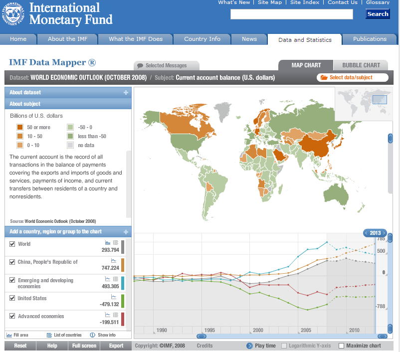
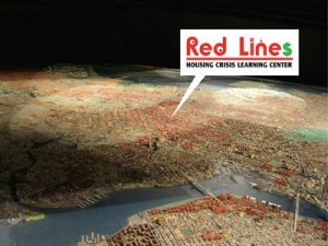
The exhibition, Red Lines Housing Crisis Learning Center  at the Queens Museum of Art (through Sept 23) is a large scale installation by Damon Rich, founder of the Center for Urban Pedagogy.  The New York times reported  on the exhibition’s extraordinary centerpiece, an intricate conversion of the museum’s most famous work, the Panorama of the City of New York , to depict the location of foreclosures in the five-borough area.  The Panorama is a 9335 sq. foot scale model (1 inch = 100 ft) of Manhattan and all five boroughs made in 1964 for the World’s Fair, and updated in 1992.  On top of this 3-D “map”, Damon and his young helpers placed bright pink plastic triangles representing blocks where 3 or more foreclosures have taken place.  The result shows the concentration of foreclosures in areas where the non-white population is highest.

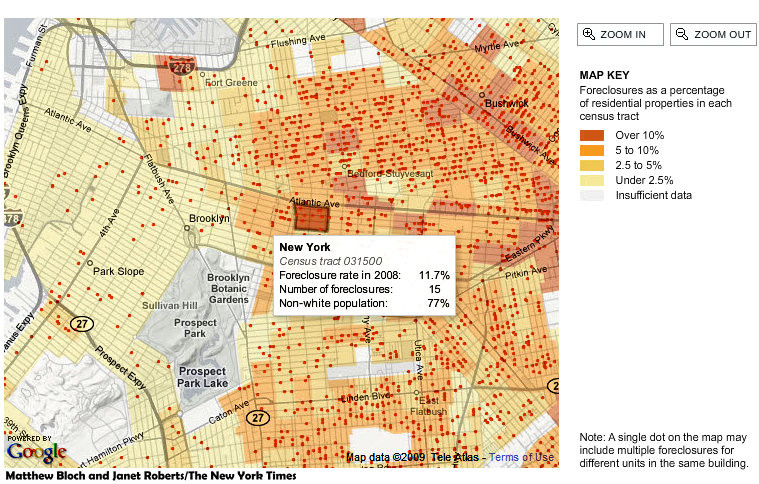
According to the Times:  ”Hundreds of these pink stigmata cover Bedford-Stuyvesant, Crown Heights, East New York and Canarsie in Brooklyn like an invading army. In Queens most markers are camped out in Ozone Park and Cambria Heights, as well as in parts of Jamaica and Corona. As for Manhattan, there are precisely two.”

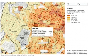
The neighborhoods with high foreclosures, according to the Times, are the same areas where the disastrous practice of “redlining” denied credit to African-American and Latino families until it was made illegal in the 1970′s.  The data used in creating the exhibition was also used by NY Times staff to create a great interactive map which allows you to see the growth of foreclosures across the area, and at the block level, since 2005.  Frightening!

Update 5/7/2018:   New Forclosure Maps from PropertyShark
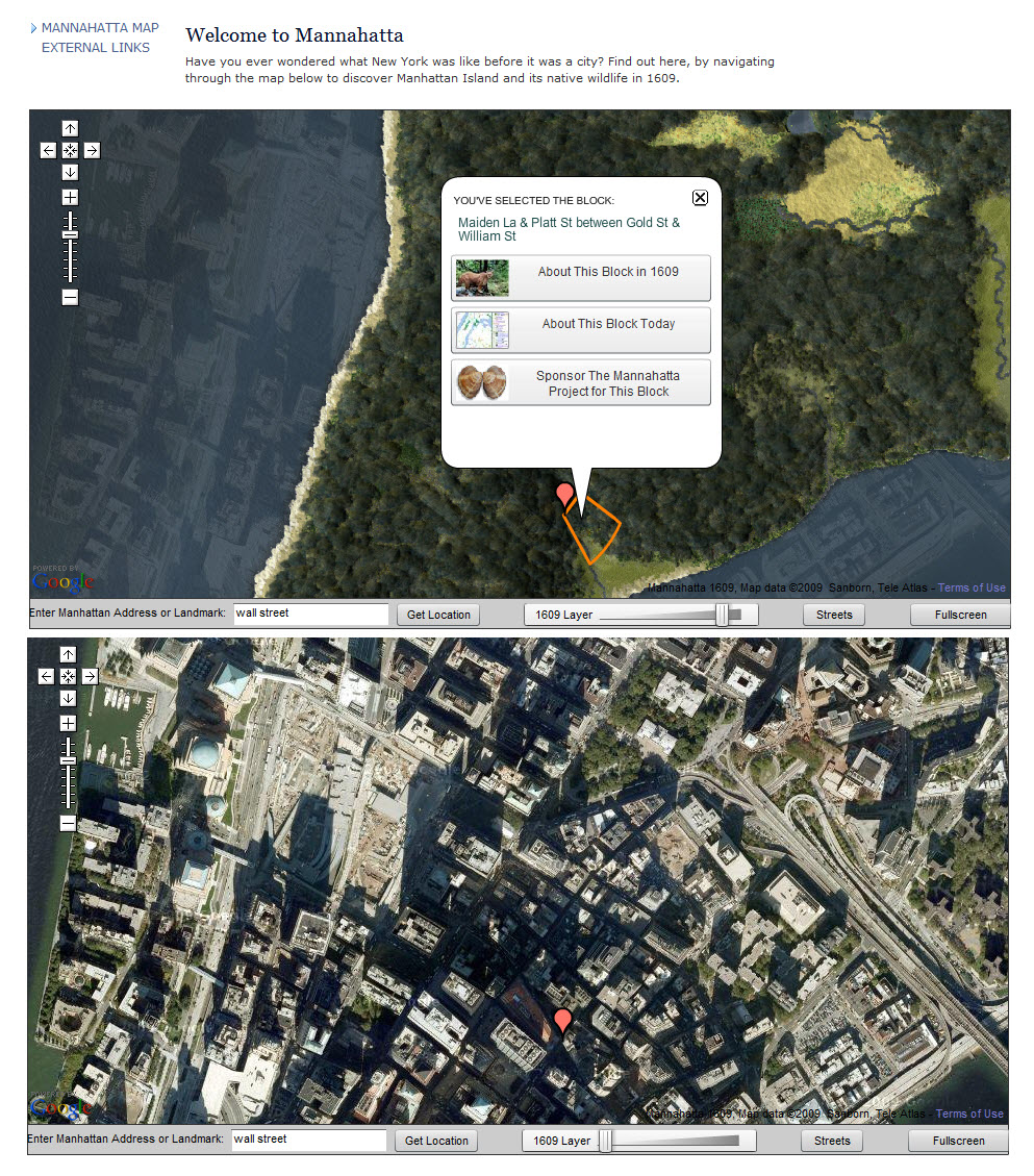
USGS Vector Maps in GeoPDF

The USGS which calls itself “the nation’s largest water, earth, and biological science and civilian mapping agency” yesterday announced the availability of free vectorized topographic maps for the US in GeoPDF  format.  Details are on their Digital Map home page.  Raster images of topographic maps have been available in GeoPDF form for some time, but the new series will include vector “layers” which can be switched on and off – contours, water, transportation, labels, etc. … just like a real GIS, but much easier to share.  So far, only Arizona is available from the USGS, but much more will be released this year.

The GeoPDF reading software (TerraGo Desktop) can be download free from the developer, TerraGo Technologies.  It is essentially a toolbar which is added to Adobe Reader which makes it possible to see the layers, to do a few spatial calculations (distance and area), and with a single click, hop into Google Maps.   This is a fascinating development for the GIS world.  Late last year ESRI announced an extension for ArcGIS 9.3 for exporting to GeoPDF.  The US government is embracing GeoPDF in a big way, so little TerraGo will probably go a long way.  After three venture-capital financing rounds will they go public, or be gulped by Google?  Could we be looking at the ultimate Google/GIS Mashup?  More later.

Update 30/6/2018: TerraGo has expanded and developed new products and remains independent.  Interesting:  TerraGo Magic 

Where are all the dollars going?


This  Recovery Map (no longer available) is a really slick interactive map mixing Google Maps with USDA (US Dept. of Agriculture) and HUD (Housing and Urban Development) data, showing ARRA(American Recovery Act of 2009) funding by state.  Click on a state and county levels to zoom in and projects appear at the local level.  The map looks like a great resource for people who want to hook into funding.  As for map-makers, I am still trying to reverse-engineer it!  Shouldn’t there be freedom of information on how to do this?

Another such map about DOE (Dept. of Energy) projects was made by ace cartographers at Axis Maps in Madison Wisconsin.  This illustrates various techniques for communicating data on a static map.  Axis Maps also posted a super video  (with a beautiful musical accompaniment composed by one of the map-makers) showing 106 10-minute steps used to create a meticulously-crafted custom printed map.  Nice!

Update 30/6/2018: Times change, new version of USDA eligibility map
Axis maps continue to amaze after 10 years! For example, see the excellent tutorial on relief mapping

Geography of Buzz

An  article in the New York Times  today discusses the use of a GIS spatial analysis technique referred to as ”cluster analysis” for an unusual application.  Researchers Elizabeth Currid of USC and Sarah Williams of Columbia University’s Spatial Information Design Lab  presented their conclusions at a meeting of the Association of American Geographers recently.  The researchers geocoded 300,000 photos and 6000 events from the Getty Imges  database.  With this data set, the Global Moran’s I statistic was used to find hotspots in New York and LA.  The conclusions may not be so very surprising, but the use of photo media is interesting.  This type of social research is likely to show up more often as people begin to mine data from geocoded images (e.g. Picasaweb and Flickr) or geotagged Tweets.

The study was partly inspired the work of  Richard Florida who developed the concept of the “creative class” and created a stir with Amsterdam planners at a 2003 conference titled “Creativity and the City”.

Update 30/6/2018: No doubt a lot more research in this area to be found. For example Trendsmap

Economic Crisis

This nicely constructed interactive flash map (no longer available) was published by the Dutch paper, the NRC, at the end of February, with data through 3Q 2008.  Not pretty, even in pink. Hopefully they will update it for 4Q, etc.  The data source is listed as Eurostat, which appears to be an excellent resource for general EU statistics.

For US economic statistics, a rich data source is the St. Louis Fed.  The NY Times published an interactive map based on Fed data, showing unemployment by county.  They updated the map from December to January (the image is December and the link is to January), but don’t yet have a map allowing monthly comparison.   In fact they use two different color classification schemes making comparison between the two maps visually impossible.   It would be nice if they made a comparative map like the NRC map.

Update 30/6/2018: These maps seem to be one-offs.  No current updates.

Made in Detroit

It seems that about 1/3 of Detroit has gone to seed.  In the past fifty years, since they heyday of Motown, the population has dropped from 2 million, to less than a million.  An article in the blog City Farmer  discusses current serious interest in converting vacant land to urban farms.  Another blog, Politics in the Zeros, also posted an article on this subject recently.

Here in Amsterdam, an astonishing film was shown at Arcam  last week. Made In Detroit by Dutch documentary filmmakers Masha & Manfred Poppenk is about Ferguson Academy for for Young Women in Detroit, an alternative high school which teaches young teen mothers to farm on the schools own grounds, less than three kilometers from the city center.  The farm includes an orchard, dairy, and bee hives, as well as organically grown crops which they sell at Detroit’s Eastern Market.  It is a beautiful and thoughtfully made film.  (Update 2009:  since posting a few hours ago, the film has been blocked pending right, permissions, etc…. hopefully it will be made available again soon.)

Update 30/6/2018: Film title changed at some point to Grown in Detroit.  Ferguson Academy (CFA) closed in 2014.  Another school for teen mothers, Pathways, replaced it, but at a different location and apparently without the farming component. 


IMF Datamapper

This sweet Flash Datamapper application from the IMF allows you to look at world economic projections through 2013.   The snapshot here shows the “current account” for each country, essentially exports minus imports.  The timeline shows China continuing to soar and the US, after a dip, holding steady, still in negative territory.    All of this data and much more is available for download from the IMF site here.

Update: 27/6/2018:  Links still work, but Datamapper is no longer flash.  Beautifully designed new (2017) interactive map!