Where are all the dollars going?
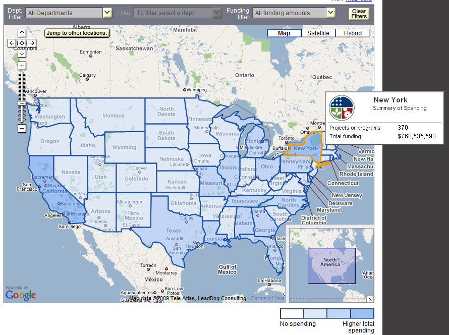 This Recovery Map (no longer available) is a really slick interactive map mixing Google Maps with USDA (US Dept. of Agriculture) and HUD (Housing and Urban Development) data, showing ARRA(American Recovery Act of 2009) funding by state. Click on a state and county levels to zoom in and projects appear at the local level. The map looks like a great resource for people who want to hook into funding. As for map-makers, I am still trying to reverse-engineer it! Shouldn’t there be freedom of information on how to do this?
 Another such map about DOE (Dept. of Energy) projects was made by ace cartographers at Axis Maps in Madison Wisconsin. This illustrates various techniques for communicating data on a static map. Axis Maps also posted a super video (with a beautiful musical accompaniment composed by one of the map-makers) showing 106 10-minute steps used to create a meticulously-crafted custom printed map. Nice!
Update 30/6/2018: Times change, new version of USDA eligibility map
Axis maps continue to amaze after 10 years! For example, see the excellent tutorial on relief mapping