Wow! A fascinating look below the surface

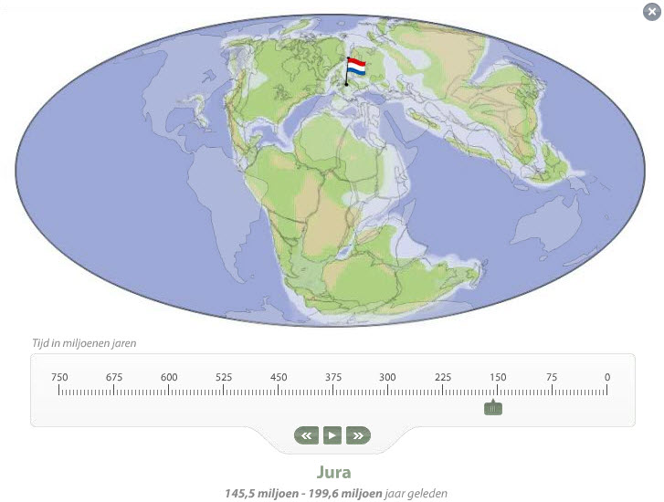
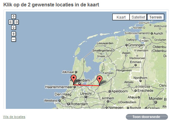
Heard about this at last fall’s ESRI Nederland conference, and finally found it on the web. A link on the Geology of the Netherlands website (mentioned in last post) goes to this sweet Google Maps interface, “Dwarsdoorsneden“. Put two points on the map of the Netherlands and click below to draw a cross section of the geological layers, the strata, formed over millions of years.  (This no longer works.)
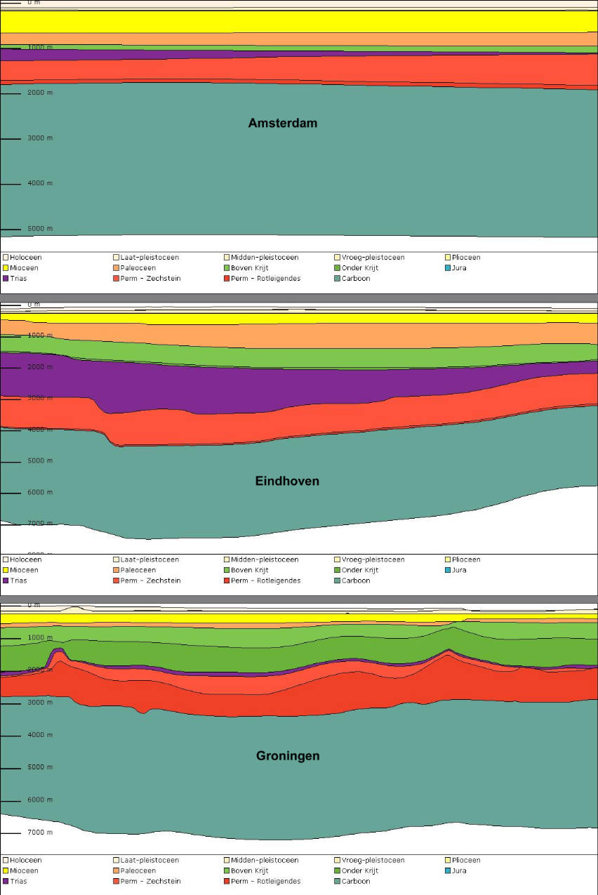
The giant Dutch research organization, TNO, and the National Museum of Natural History (Naturalis) collaborated on this application. The website also provides detailed information about all those ancient periods, including the creatures who roamed the Dutch landscape. I’ll never work again. Too much fun.
Update 3/9/2018:  What a pity that the “dwarsdoorsneden” map no longer works!  The rest of the website is still fascinating

Center of the World

The Dutch website “Geologie van Nederland” offers many wonderful resources, including a great animation (the Netherlands on the Globe) of the shifting continents in which the little Dutch flag remains front and center. In case you didn’t know it, you can use Google Translate to read pretty-good translations of website… like this one for the website Geology of the Netherlands

Metro Bowls

Perhaps a birthday present for me?  Anyone??  Order online from Dutch designer Frederik Roijé. I’ve seen them and they are amazing.

Update 3/9/2018: Nobody has given me one yet.

Mapping on This American Life

This episode of This American Life is almost 13 years old, long before “MyMaps”. The theme of the episode is “Mapping” and there are five parts, one for each of the five senses. Part one, Sight, is an interview with Denis Wood a thought-provoking discussion about why maps are only meaningful because they do NOT show everything.  Being “selective” is the key to making a any map.  This is the only segment which is directly related to maps in the SweetMaps context. But the rest is pure fun:
Hearing — the sound of ordinary home and office background noises and how they can drive you nuts.  Smell — an attempt to understand (or map) the functioning of the Nose, and to construct a commercially-available electronic nose, including a replacement for canine drug-sniffers.  Touch — a woman obsessively maps her body, fearing cancer.  Taste — one man’s description of tastes on in the neighborhood of Pico Boulevard in LA.  Classic Ira Glass.

Making Maps – Looks Good

The second edition to a “classic” for cartographers will soon be available. The authors are John Krygier, a geography prof at Ohio Weslyan and past-president of the North American Cartographic Information Society (NACIS), and the extraordinary mapmaker and designer, Denis Wood. Krygier has an interesting blog, now on my RSS list.

Update 3/9/2018: The Third Addition is now available.

Queensland Down Under

We watch helplessly as Queensland went down under this week, and then gradually resurfaced wallowing in mud with at least 18 lost lives and billions in damages.  Examples of disaster maps produced in response to the crisis include:  1) Before and after photos by Nearmap.com, an Australian company offering areal photography services showing change over time in an Open Street Map environment.  2) Google’s crisis response map. 3) The Brisbane City Council situational awareness map created by  ESRI Australia using ArcGIS and Bing Maps.


FourSquare — I get it!

Feeling rather elated, and I’ve just started! Went to the supermarket and checked in. There was one other person there (supposedly). That gave me a warm giddy feeling of small world-ness, friendship, mystery. Who was this person? Pondering this, I realized that if everyone in the store had FourSquare, it would be absolutely of no interest at all – unless they were my real friends. Anyway, this is a fascinating new-for-me technology. Gotta wonder what they do with all that data. I’d better read the small print.  Like why did it post this on FaceBook?

Mapmakers Extraordinaire!

The jig is up. These are the pros: Axis Maps. Based in (I think) Madison Wisconsin, these guys combine all the technical skills with fantastic design. Much to be learned on their website, including many useful GIS resources, and links to their Indiemapper online map-making site. It appears they also worked with Fortiusone to develop the online map interface for Geocommons.

Update 3/9/2018:  Geocommons appears to be broken, but a description of the map service is here, at Duke.

Snow (almost) everywhere in the States

Via GISUser blog:  “There’s snow in all the contiguous States except Florida – and in a good portion of Canada too! Via NOAA, Every state, with the exception of Florida, currently has snow on the ground. This includes Hawaii where about seven inches of snow is atop Mauna Kea. As of Jan. 11, 69.4 percent of the contiguous United States is covered by snow – this is more than double the snow cover from last month. This week’s snow storm in Southern states has allowed for this unusual occurrence.(Image credit: NOAA)”