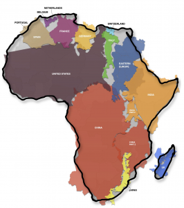
 Just came across a graphic produced in November 2010 by Kai Krause which shows Africa swallowing up many countries and even continents which we typically think of as larger, including the US, China, and Europe. Mr. Krause points out that the great misconception has been propogated by the standard use of the Mercator Projection which was created by Mercator in 1569 to represent the world in such a way as to keep make it easier to navigate from one place to another because it flattens the earth and turns it into a rectangle. Therefore the areas of countries closer to the poles are exaggerated, while those closer to the equator are understated.
As was pointed out by The Economist, the actual graphic used by Mr. Krause is not a perfect representation of the proportions. For a more accurate representation, the writer used the Gall’s Stereographic projection (which I used to use at Johnson Controls!) which is an “equal area” projection designed to keep countries areas in proportion. The conclusion is the same, maybe a little less dramatic, but another nice graphic.
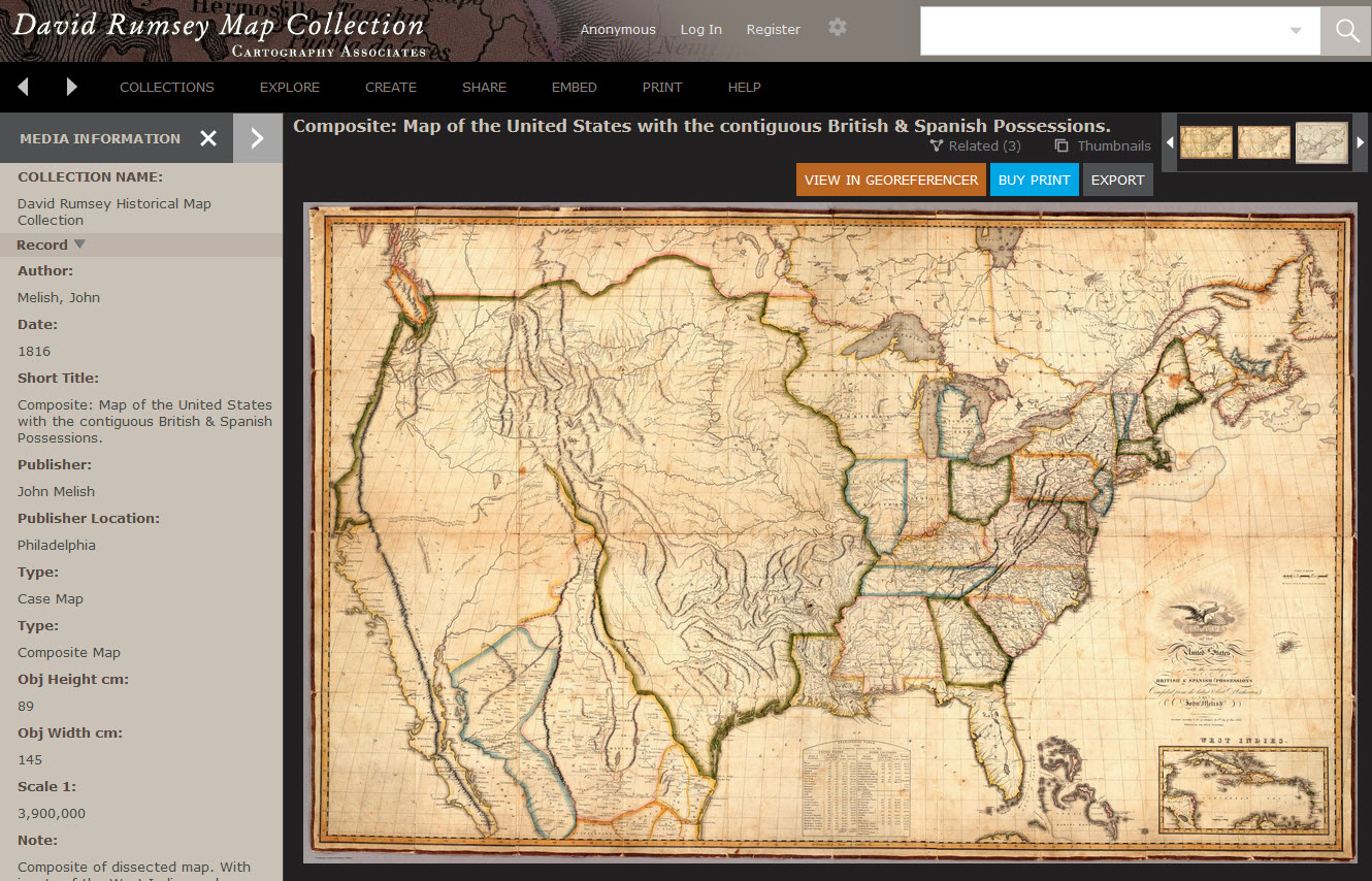 I’ve known about the exciting David Rumsey Historical Map Collection for more than a decade, and have used it from time to time as a resource for research. The physical collection has more than 150,000 maps, mostly of North and South America, but also the rest of the world. About two thirds of the collection have been digitized and with this database are easily searchable.
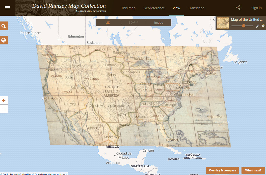 The technology used includes LUNA software (by Luna Imaging in L.A.) for creation and processing, and Georeferencer software from the Swiss company Klokan Technologies. With this software, the transparency of the historical map can be adjusted to see the google-maps layer below. Fascinating!