Economic Crisis
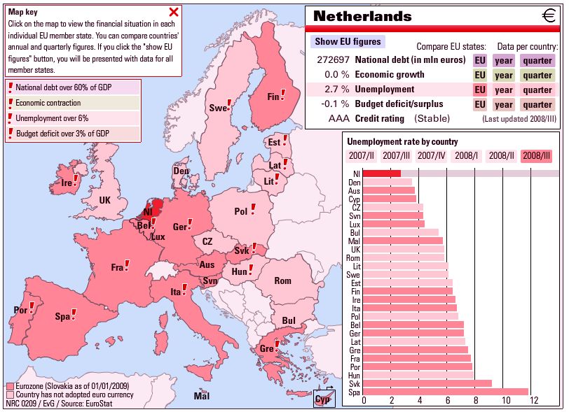 This nicely constructed interactive flash map (no longer available) was published by the Dutch paper, the NRC, at the end of February, with data through 3Q 2008. Not pretty, even in pink. Hopefully they will update it for 4Q, etc. The data source is listed as Eurostat, which appears to be an excellent resource for general EU statistics.
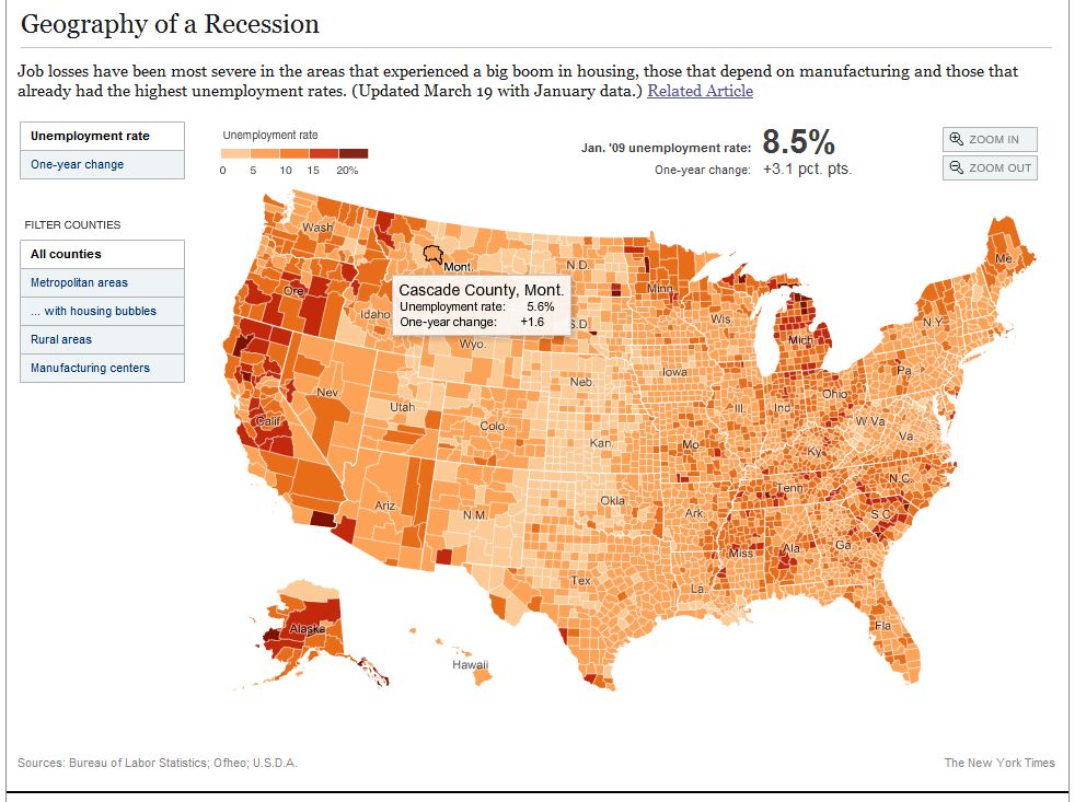 For US economic statistics, a rich data source is the St. Louis Fed. The NY Times published an interactive map based on Fed data, showing unemployment by county. They updated the map from December to January (the image is December and the link is to January), but don’t yet have a map allowing monthly comparison. In fact they use two different color classification schemes making comparison between the two maps visually impossible. It would be nice if they made a comparative map like the NRC map.
Update 30/6/2018: These maps seem to be one-offs. No current updates.