Immigration Exploration
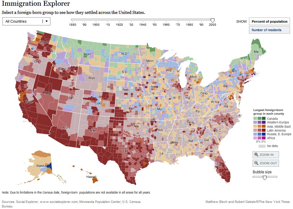 The NY Times published this Immigration Explorer interactive map with some fascinating information about immigration in the US since 1880, a great example of using Flash for visualization of data over time. You can view populations by country of origin as well, through time, though unfortunately not Dutch settlers. Note all the Russians in Alaska! (Of course a small number, but a significant percentage.) The map was made with data from Social Explorer, which looks like an interesting service, though their pricing is not clear.
 NYT seems to have their own flash developers, like Matthew Bloch, who studied at the University of Wisconsin – Madison (go Badgers!). Matthew, with Prof. Mark Harrower of Colorbrewer fame, also developed Mapshaper, an online service for simplifying shape files. I can use this! Note: the map on the right is extreme… many usable gradations exist between the two. (This is really for GIS techies.)
Update 30/6/2018: A newer map, still using old (2007) data Migrations Mapand this good website from Pew Research showing world migration (legal)… doesn’t seem to count refugees.